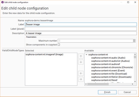
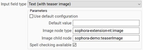
There are multiple options to configure an input field as text. A few parameters are available to all of them:
| Parameter | Description | Default | Range of Values |
|---|---|---|---|
| Default Value | You can define a default text which will be assigned to this property initially in every new document. The default value will be assigned just once; if you alter or delete the content of the property, the default value will not be reassigned to it under any circumstances. | An arbitrary string | |
| Character Counter | Determine, whether a character counter should be displayed next to the input field. A maximum is displayed if the parameter Max. Character Count is configured. | false | true/false |
| Number of Lines | This determines the number of lines the input field will display at the same time. For example, if you set it to 2, the input field will always have a height of 2 text lines. You still may enter more lines of text, you then can scroll up and down within text field. Solely if Number of Lines is set to 1, there will always be just a single text line and you also cannot enter paragraphs. | 1 | positive integers |
| Validation Expression | You can configure a regular expression the text in the input field is checked against, for example if the field should only contain lowercase characters. If a user violates this regex, he cannot save the document. | See here |
Text
This field may only contain unformatted plain text.
| Parameter | Description | Default | Range of Values |
|---|---|---|---|
| Max. Character Count ### | Specify a limit for the number of characters this field should contain. If the number is exceeded it is still possible to save the document, yet a warning will be displayed to the user. The maximum is also displayed in the character counter. | Unlimited | Positive integers |
| Spell Checking Available | Determine, whether spell checking should be available within this input field. | false | true/false |
| Inherit Structure Value | See here | false | true/false |
| Placeholder | You can set a placeholder text for the field which will be displayed whenever the field is empty. Unlike the default text, the placeholder text does reappear even when the property has been altered. The placeholder text may contain bold or italic letters, even if the property itself does not support markup. | An arbitrary string |
Text (Multi)
A text (multi) property may contain multiple text fields, though it is not possible to enrich them with any kind of markup. Nevertheless, you still can make spell checking available and you may also set a maximum number of text fields (by default, there is no limitation on the number of text fields within this property).
Text (Fixed Size)
This is an input field for content depending on size and font. The width, height and font of the field each can be configured by parameters. The field wraps words at the end of text lines automatically with hyphens and supports spell checking. The content is saved in XML format to preserve manual and automatic line breaks. On the right you can see an example of the format in which the content of such a field is saved.
<property name="sophora-demo:fixedSizeText">
<value><?xml version="1.0" encoding="UTF-8"?>
<sophora>
<logicalContent>
<line>A text field of 400 x 300 pixels per page in font "Arial" (16 pt). Only one page is allowed. This field type supports automatic hyphenation.</line>
<manualhyphenations />
</logicalContent>
<visualContent>
<line>A text field of 400 x 300 pixels per page in </line>
<line>font "Arial" (16 pt). Only one page is allo-</line>
<line>wed. This field type supports automatic hy-</line>
<line>phenation.</line>
</visualContent>
</sophora>
</value>
</property>| Parameter | Description | Default Value | Range of Values |
|---|---|---|---|
| Max. Character Count ### | Specify a limit for the number of characters this field should contain. If the number is exceeded it is still possible to save the document, yet a warning will be displayed to the user. The maximum is also displayed in the character counter. | Unlimited | Positive integers |
| Max. Width in Pixels ### | The fixed width of the field and therefore maximum width of the text in pixels. This value will be overruled by Max. Width in Characters. | 0 | Positive integers |
| Max. Height in Pixels ### | The fixed height of the field and therefore maximum height of the text in pixels. This value will be overruled by Max. Height in Lines. | 0 | Positive integers |
| Max. Width in Characters ### | The fixed width of the field and therefore maximum number of characters per line. This value overrules Max. Width in Pixels and requires a monospace font. | 0 | Positive integers |
| Max. Height in Lines ### | The fixed height of the field and therefore maximum number of text lines. This value overrules Max. Height in Pixels. | 1 | Positive integers |
| Page Exceeding Error | Prevents the saving of a document if the maximum number of lines is exceeded (otherwise there will be just a warning). Has no effect, if it is allowed to create multiple pages. | false | true/false |
| Multiple Pages Allowed ### | Specify, whether only one or multiple pages should be allowed. This is only available for users of the Teletext 2.0 add-on. | false | true/false |
| Spell Checking Available | Determine, whether spell checking should be available within this input field. | false | true/false |
| Font Name | Select a special font for this input field. Note, that each font has to be installed on your operating system. | Roboto | The fonts that are installed on your OS |
| Font Style | Select a font style. | Normal | Normal, Bold, Italic |
| Font Size | Select a font size. Will only be applied if a font name is selected. | 12 | Positive integers |
| Text Color | Specify the text color. You can choose out of a few predefined ones or configure your own color based on RGB values. The add-on Teletext 2.0 must be purchased to use this feature. | Black (0, 0, 0) | Any color |
| Text Color Changeable | Enables the user to change the color of words. The add-on Teletext 2.0 must be purchased to use this feature. | false | true/false |
| Background Color | Specify the background color. You can choose out of a few predefined ones or configure your own color based on RGB values. The add-on Teletext 2.0 must be purchased to use this feature. | White (255, 255, 255) | Any color |
| Background Color Changeable | Enables the user to change the background color of the text field. The add-on Teletext 2.0 must be purchased to use this feature. | false | true/false |
| Text Links | Allows the use of text links by dragging a document onto selected text.The add-on Teletext 2.0 must be purchased to use this feature. | false | true/false |
| Line counter | Show a line counter. | false | true/false |
Text (with Styles)
This field may contain rich text, i.e. formatted text with bold or italic letters etc.
| Parameter | Description | Default Value | Range of Values |
|---|---|---|---|
| Max. Character Count ### | Specify a limit for the number of characters this field should contain. If the number is exceeded it is still possible to save the document, yet a warning will be displayed to the user. The maximum is also displayed in the character counter. | Unlimited | Positive integers |
| Spell Checking Available | Determine, whether spell checking should be available within this input field. | false | true/false |
| Text Links Supported | You can configure, whether text links, i.e. links to other documents or external links, should be supported within the field. | false | true/false |
| Supported Markups | You may define which types of markups should be supported and which should not. | None | Languages, Abbreviations, Quotes |
| Placeholder | You can set a placeholder text for the field which will be displayed whenever the field is empty. Unlike the default text, the placeholder text does reappear even when the property has been altered. The placeholder text may contain bold or italic letters, even if the property itself does not support markup. | An arbitrary string |

