Introduction to Select Values
There are input fields you can define different kinds of predefined selections for. These select values are stored in separate documents. The mode of operation of select values is as follows: Select value documents provide a mapping of internally saved keys ("Value") and associated labels ("Label") that are displayed to the user. Depending on whether or not such select values are required in the delivery the according document need to be published.
You can set default values that apply for the entire repository and you can define certain values that only account partly, i.e. for an individual site or structure node. Furthermore, you can determine the ordering in which the given values appear in the dropdown menus as well as the value that should be selected in advance.
To create a new list of select values,
- Mark the left-hand menu item "SelectValues" within the administration view, open its context menu and select "New: SelectValue".
- Specify the structure node and the ID stem to store the document at within to emerging dialog.
- Click "Finish" and an empty select value document opens with three smaller sections to provide information:
- Base – Here you have to specify the name of the select value document. This will be the label that appears in the list of all select value documents within the administration view. The checkbox "Category SelectValue" determines whether this document should belong to the Enhanced Categories and thus might be visible (and editable) to non-administrative users (compare to section Enhanced Categories of the user guide).
- Icon – This will be the icon that represents the entire list of values (in contrast to the icons which might be assigned to individual values as explained below). If this select value document is marked as "Category SelectValue" (in the "Base" section above), this icon will be shown upon the enhanced categories toogle buttons within the search view when this category is picked by the user.
- Select Values – The are two possibilities to define the actual select values:
- Select the line "(Default values)" within the table and click the "New subvalue" button next to it in order to specify a globally valid select value or
- click "New node", select a certain structure node or site you want to define special values for and click the "New subvalue" button.
- To define a standard value, that should be pre-selected in the drop-down menu, mark an entry and click the "Default" button.
- To define an icon for a select value click the button in the corresponding table cell and upload an icon (valid file formats are
JPEG,GIF,PNGorSVG) with a resolution of 24x24 px (exceptSVGfiles, which are automatically scaled to the appropriate resolution). - When you are finished, save the select value document.
The following screenshot presents five select values that apply for all websites and structure nodes and the default value is "Story". The structure node "/demosite/trendcities" has a different setting: Here, only two values are available and the default value is "File". Thus, when this select value is configured to an input field of a certain document type, the provided set of value is different within documents that are located at the structure node "/demosite/trendcities" and document that are located elsewhere.
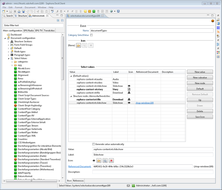
Icons within Select Values
Each select value may be arranged with an individual icon. To define an icon for a select value click the button in the corresponding table cell and upload an icon (valid file formats are JPEG, GIF, PNG or SVG) with a resolution of 24x24 px (except SVG files, which are automatically scaled to the appropriate resolution). To delete or save an icon, mark the according select value and apply the desired button on the right side of the table. These actions are also available in the context menu of each select value.
Exemplary Usage of Select Value Icons with Components
In this example, a text alignment can be set for referenced stories. The alignment has to be set in the component details view and is shown as an icon upon the components tab of the document editor.
As a first step, create a select value called "Alignment" with the following values and icons: "left" [ICALIGNLEFT], "centered" [ICALIGNHORIZONTALCENTER], and "right" [ICALIGNRIGHT]. The created select value is shown in the following image:
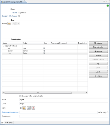
Within the administration view, open the document type "sophora-content-nt:storyref". Insert the following text on the CND tab:
<'sophora-content-nt'='http://www.subshell.com/sophora-content-nt/1.0'>
<'sophora-content'='http://www.subshell.com/sophora-content/1.0'>

['sophora-content-nt:storyref'] > 'sophora-content-nt:refBase'
  orderable
  - 'sophora-content:alignment' (string)
Change to the properties tab of this node type configuration after saving the CND. There is now a new property called sophora-content:alignment in the section Display tab: system. Move the property to the section Display tab: base and edit its properties. Select "Selection value (list)" as the InputFieldType, choose "SelectValue document" as SelectValue provider and select Alignment from the List of SelectValue documents
The configured property is shown in the following image:
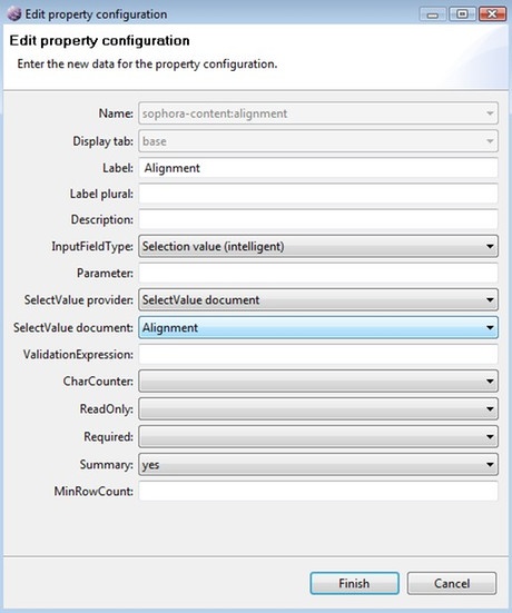
Switch to the Attributes tab and add the sophora-content:alignment property to the selected Search result properties.
The configuration of the sophora-content-nt:storyref document type is now finished. Save and close the document.
To use the alignment property within a document reference, execute the following steps:
- Create a new story (or open an existing story document).
- In the Component structure, add a new Teaserlist group.
- Add two stories to the Teaserlist group
- Select the first story in the Component structure.
- In the Component details view, check the Alignment box and set the alignment to "Left".
- Select the second story in the Component structure.
- In the Component details view, check the Alignment box and set the alignment to "Right".
- Finally, go to the Components tab of the opened document. It shows the two referenced stories with icons for their selected alignment.
The following picture shows the final story document:
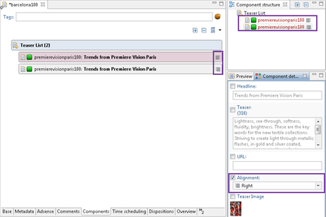
Examples How to Use Select Value Icons Within Component Groups
Additionally to the aforementionend Components, Component Groups can also be configured to display Select Value Icons.
Select Value Icons of Component Groups are visible on the Components Tab and on Paragraph Boxes within the Copytext Editor.
In order to shorten this example we will use the "Alignment" Select Value from the first example.
Since we already got a Select Value, we can start right away with adding the new property to the nodetype of the Component Group.
Within the administration view, open the document type "sophora-content-nt:storylist". (If the document type does not exist, you may create it yourself. The only precondition is the nodetype must extend 'sophora-extension-nt:group'.) Insert the following text on the CND tab:
<'sophora-content-nt'='http://www.subshell.com/sophora-content-nt/1.0'>
<'sophora-extension-nt'='http://www.subshell.com/sophora-extension-nt/1.0'>
<'sophora-content'='http://www.subshell.com/sophora-content/1.0'>

['sophora-content-nt:storylist'] > 'sophora-extension-nt:group'
  orderable
  - 'sophora-content:alignment' (string)
After saving the CND, change to the properties tab of the node type configuration and move the property sophora-content:alignment from Display tab: system to Display tab: base. Now double click the entry to edit its configuration. Select "Selection value (list)" as the InputFieldType, choose "SelectValue document" as SelectValue provider and select the Alignment select value (created in the first example) from the List of SelectValue documents.
Now switch to the Attributes tab and add the sophora-content:alignment property to the selected Search result properties.
The configuration of the sophora-content-nt:storylist document type is now finished. Save and close the document.
Displaying a Select Value Icon on a Component Group in the Components Tab
Precondition: Open the document type sophora-content-nt:story and make sure your node type is configured as a valid child node type to the child node sophora-content:box.
To use the alignment property within a group in the Components Tab, execute the following steps:
- Create a new story (or open an existing story document).
- In the Component structure, add a new "Box: Teaser" group. ("Box" is the label of the child node and "Teaser" is the label of the Component Group node type.).
- Add one or more documents to the group.
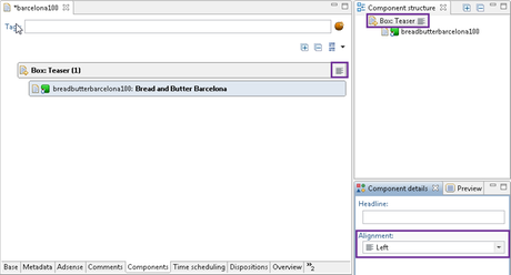
- In the Component structure, select the group "Box: Teaser". The Alignment property should now be visible in the Component details view.
- In the Component details view, set Alignment to "Left".
- Finally, go to the Components tab of the opened document. The selected alignment icon should be visible in the title bar of the group.
The following picture shows the final story document:
Displaying a Select Value Icon on a Paragraph Box in the Copytext
Open the document type sophora-extension-nt:paragraph and make sure your node type is configured as a valid child node type to the child node sophora-extension:paragraphbox.
- Create a new story (or open an existing story document).
- Right-click on the Copytext and select New group > Paragraphbox > Teaser.
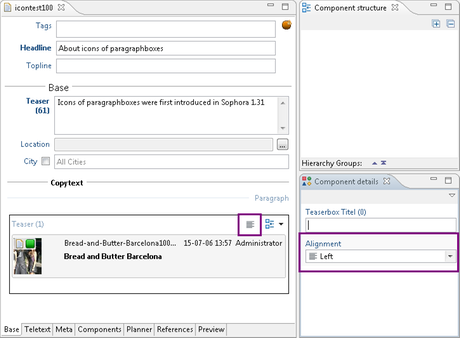
- Select the newly created group by clicking its title. The Alignment property should now be visible on the Component details view.
- In the Component details view, set Alignment to "Left".
- The selected alignment icon should now appear in the title bar of the group.
The following picture shows the final story document:
Using Document References
Each value of the select values may have a reference to another document. You can enter a documents' external Id or Sophora-Id in the Referenced Document field. Alternative you can drop a Sophora document into that field, e.g. from Search. It is possible to drop a document into the select values table to create a new value, too. In that case, the value and label field are filled with the document reference label of that document automatically. In each case, the external Id of the document is stored as reference value. To open the referenced document either click on the underlined label of the select value field, double click on the entry in the table or use the context menu.
Usage of Enhanced Categories
Enhanced categories are modelled as select values so that some benefits are built in by default. First off all, you can create custom category trees by adding or extending as many according select value documents as you wish. Secondly, you can define different categories for individual sites or structure nodes so that they are available globally or locally as explained in the following subsection.
Note that only Sophora administrators can initially create a new enhanced category since you need to create a new select value document (where the checkbox "Category SelectValue" has to be selected). As soon as such an enhanced category document is saved the first time, it will be visible within the "Enhanced Categories" view und thus any user with according permissions (dependent on where this document is located) may edit this enhanced category. Therefore the user guide also contains a section about enhanced categories which might be interesting for you to read as well.
To enable the assignment of enhanced categories to documents, you have to configure a select value input Field for each individual category.
Enhanced Categories Across Several Site or Structure Nodes
As with conventional select values, you can mark a certain entry as default and change the ordering by clicking the corresponding buttons when the desired entry is selected.
If you wish to differentiate your categories between individual sites in your repository, execute the following steps:
- Click the button "New node" next to the table in section "Select values" of the editor.
- Select the site you want to define custom categories for.
- Next, click on the "New subvalue" button besides the table.
- Provide a value or let it be generated automatically and a label in the pop-up dialog (this label is what will be displayed later). You can even provide an icon here, if you want to.
- Click "Ok" or "Add Another Value" to continue.
- Finally save the document and all values subordinate to the inserted site will only be available in documents that belong to this particular site.
If you wish to share some categories across sites, thus use them globally, execute the following steps:
- Mark the entry "(Default values)" in the table in section "Select values" of the editor.
- Next, click on the "New subvalue" button besides the table.
- Provide a value or let it be generated automatically and a label in the pop-up dialog (this label is what will be displayed later). You can even provide an icon here, if you want to.
- Click "Ok" or "Add Another Value" to continue.
- Finally save the document and all values subordinate to "(Default values)" will be available throughout your repository.
Note that the steps as illustrated above account for structure nodes as well.
Using Query Select Values as an Enhanced Category
Query select values may also be used for an enhanced category. Since query select values are not configured with a corresponding select value document, such an enhanced category has to be configured in its property configuration. Please refer the documentation of the corresponding input field types for further information.
Exporting Select Values
To export a select value document,
- Expand the left-hand menu item "SelectValues" within the administration view.
- Mark the select value documents you want to export, open the context menu and select "Export...". You can select multiple documents at once by pressing the CRTL key and clicking the individual documents.
- In the emerging dialog, you have to specifiy, amongst other things, the Sophora XML version as well as the target directory.
- Click "Finish" to start the export procedure.
To export all select value documents at once,
- Mark the left-hand menu item "SelectValues" within the administration view, open the context menu and select "Export...".
- In the emerging dialog, you have to specifiy, amongst other things, the Sophora XML version as well as the target directory.
- Click "Finish" to start the export procedure.
Select value documents are exported according to the Sophora XML Schema and can be imported againg using the Sophora Importer.